
Introduction
Spring is a season of renewal, where nature bursts into bloom and the world seems to shake off the dormant chill of winter. The air is filled with a sense of hope and vibrancy, inviting you to refresh your surroundings. As the days grow longer and sunlight floods in, it’s the perfect time to consider how color can transform your space. Colors have a profound impact on your mood, influencing feelings of calmness, joy, and creativity. This spring, embracing soft pastel color palettes can breathe new life into your home, evoking the gentle beauty of blossoming flowers and clear skies.
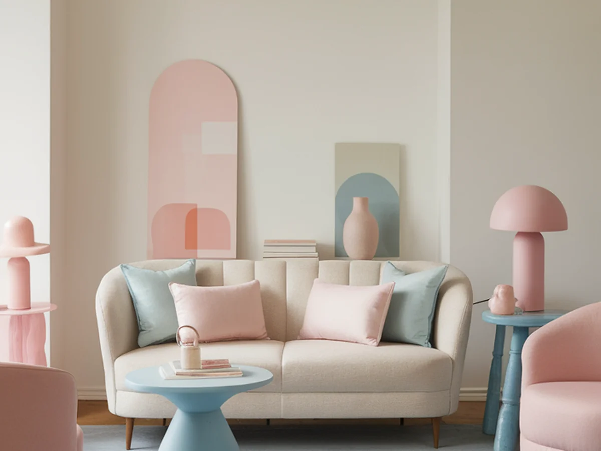
Soft pastels—think delicate pinks, soothing blues, and mellow greens—are trending this season for their ability to create serene and inviting environments. They provide a gentle backdrop that can enhance your mood and make your home feel more spacious and airy. This article will guide you through practical tips and inspiring ideas to revitalize your space with pastel hues, helping you create a sanctuary that reflects the beauty of spring.
“Creating a cozy reading nook is all about maximizing comfort in a small space. It’s about intentional design that serves both function and feeling.”
– Interior Design Magazine
Understanding Pastel Colors
Pastel colors are defined by their soft, muted tones, often created by adding white to primary colors, resulting in a palette that feels both gentle and uplifting. These colors are characterized by their lightness and subtlety, making them ideal for creating tranquil spaces. In interior design, pastels can evoke feelings of serenity and comfort, making them perfect for areas where relaxation is key.
The psychology of color reveals that soft hues can have a calming effect on the mind and body, helping to reduce stress and promote a sense of peace. Pastel shades such as lavender, mint, peach, and baby blue are particularly popular in spring, as they mimic the colors found in nature during this vibrant season.
Historically, pastel colors emerged in the late 18th century when artists began using softer pigments to create more tender and whimsical artworks. These hues gained popularity in interior design during the mid-20th century, and they continue to evolve, reflecting contemporary tastes while retaining their inherent charm.
Choosing the Right Pastel Palette for Your Space
Before diving into your pastel transformation, it’s essential to assess your current color scheme and furnishings. Take a moment to evaluate the existing colors in your space and how they make you feel. Consider the size and layout of the room, as well as the lighting, which can dramatically affect how colors appear.
When selecting a pastel palette, think about your personal style. Do you prefer a cohesive look with a single dominant pastel, or do you envision a more eclectic arrangement with multiple shades? Combining pastels with neutrals is an excellent way to achieve a balanced look—light grays, whites, and beiges can help anchor the softer hues without overwhelming the space.
Here are some successful pastel palette ideas for various rooms:
| Room | Pastel Palette | Accent Colors |
|---|---|---|
| Living Room | Powder Blue & Soft Peach | White & Light Gray |
| Bedroom | Lavender & Mint Green | Beige & Cream |
| Kitchen | Soft Yellow & Baby Blue | Natural Wood & White |
These combinations can help you create a harmonious atmosphere that feels fresh and inviting.
Incorporating Pastel Colors Through Paint
Paint is one of the most effective ways to introduce pastels into your home. When selecting paint, consider the type of surface you’ll be applying it to, as different surfaces may require different paint formulations. For walls, a matte finish can create a soft, inviting look, while glossy finishes can add a touch of shine to accent pieces.
When painting with pastels, you can choose to create an accent wall for a pop of color or immerse the entire room in a soft hue. Accent walls are particularly effective in smaller spaces, drawing the eye and creating a focal point without overwhelming the room. If you opt for full-room painting, consider using varying shades of the same color to add depth and interest.
It’s crucial to test paint colors in your space before committing to them. Many paint stores offer sample pots, allowing you to paint swatches on your walls and observe how they look in different lighting throughout the day. This step can save you from costly mistakes and ensure that you choose shades that truly resonate with your vision.
Accessorizing with Pastel Decor
Once you’ve set the stage with your walls, it’s time to accessorize! Selecting furniture and decor items in pastel shades can enhance the overall aesthetic. Look for pieces like soft-colored sofas, pastel throw pillows, and delicate tableware that can tie the room together.
DIY projects offer a fantastic opportunity to customize your decor. Consider creating your own pastel home accessories, such as painted vases or decorative trays, which can serve as unique conversation starters. Layering textures is also essential; incorporating soft fabrics like cotton, linen, and velvet can add warmth and comfort to your pastel palette.
When arranging your decor, keep balance in mind. Grouping items in odd numbers can create visual interest, while varying heights can add dimension. Place pastel items against more neutral backgrounds to allow them to shine and bring your space to life.
Pastel Color Combinations and Themes
Exploring complementary color schemes is vital when working with pastels. Certain colors naturally enhance one another, creating a cohesive look that feels curated and intentional. For example, pairing soft pink with light green can evoke a garden-like atmosphere, while a combination of baby blue and lavender can transport you to a peaceful retreat.
Themed rooms can also benefit from pastel palettes. Consider creating a coastal-inspired space with soft aqua and sandy beige, or a vintage-style room with pastel florals and antique furniture. Using pastels allows you to create a seasonal shift in decor without changing everything; simply swapping out a few key accessories can refresh your home and keep it feeling relevant to the season.
If you’re looking to update your decor without committing to a full makeover, consider seasonal accessories such as pastel-colored throw blankets, cushions, or artwork that can be easily rotated for a fresh look.
Outdoor Spaces: Bringing Pastels to Your Garden or Patio
Don’t forget about your outdoor spaces! Pastels can bring a soft touch to your garden or patio, creating a serene environment for relaxation and socializing. Consider using outdoor furniture in pastel shades, like mint green chairs or a pale yellow table, to create an inviting area for gatherings.
Plant choices are equally important. Incorporate flowers in soft pastel hues, such as pale pink peonies, lavender, or white daisies, to complement your outdoor decor. Arranging these flowers in pastel pots can further tie the look together while enhancing the overall aesthetic of your outdoor space.
Creating a cohesive indoor-outdoor aesthetic is key to making your home feel complete. Use similar pastel colors for both indoor decor and outdoor furniture to create a seamless transition. Additionally, consider DIY projects such as painting garden pots or creating pastel-colored outdoor art to enhance your space’s charm.
Maintaining Your Pastel Palette Throughout the Year
As seasons change, it’s essential to maintain your pastel palette while incorporating seasonal elements. One of the best ways to do this is by rotating accessories that complement your base colors. In spring, consider adding floral arrangements or pastel-colored throw pillows, while in summer, you might introduce lighter fabrics and breezy textures.
Cleaning and caring for your pastel decor is crucial to keeping it looking fresh. Use gentle cleaning solutions to avoid damaging softer colors, and be mindful of sun exposure, which can cause fading. Rotating accessories can also help maintain interest and freshness in your decor throughout the year.
To keep your look from becoming stagnant, consider making small adjustments to your space, such as changing up art pieces or adding seasonal decorations that align with your pastel base. This way, your home remains inviting and vibrant, embodying the spirit of spring no matter the season.
Inspiration from Interior Designers and Influencers
Many renowned interior designers and influencers embrace pastel palettes, showcasing their versatility and charm. Designers like Kelly Wearstler and Jonathan Adler often incorporate soft hues into their projects, emphasizing their ability to create elegant and inviting spaces.
Social media platforms such as Instagram and Pinterest are treasure troves for pastel decor inspiration. Search for hashtags like #PastelHome or #SpringDecor to discover countless ideas from fellow decor enthusiasts. You’ll find everything from beautifully styled pastel rooms to DIY projects that inspire your own creativity.
Engaging with the community can also provide motivation and insight. Share your pastel transformations on social media to connect with others who appreciate this aesthetic. You might even find your space featured in a roundup of pastel-themed decor!
Conclusion
Embracing soft pastel colors this spring can transform your home into a serene sanctuary, enhancing your mood and creating a welcoming atmosphere. With the practical tips and inspiring ideas outlined in this article, you’re ready to experiment with pastels in your own space. Whether you opt for a full paint job or a few carefully selected accessories, each choice contributes to a refreshing spring revival.
So, why not take the plunge? Share your pastel transformations on social media and inspire others to revitalize their spaces. Remember, color has a lasting impact on home design, and by incorporating pastels, you’re not just decorating; you’re creating a vibrant expression of the season.
Frequently Asked Questions
What are pastel colors?
Pastel colors are soft, muted hues that are created by adding white to primary colors. They are characterized by their lightness and subtlety, resulting in a palette that feels gentle and inviting. Common pastel shades include baby blue, soft pink, mint green, and lavender, making them popular choices for spring decor.
How do pastel colors affect mood?
Soft pastel colors are known for their calming effects on the mind and body. They can create a soothing environment that enhances feelings of relaxation and peace. Studies in color psychology suggest that pastel hues can promote tranquility, making them ideal for spaces where you want to unwind and destress.
Can I use pastels in small spaces?
Absolutely! Pastel colors can make small spaces feel larger and more open. Lighter shades reflect light, which can help create an airy atmosphere. Consider using soft pastels on walls and incorporating light-colored furniture and decor to enhance the feeling of spaciousness.
How can I maintain pastel decor throughout the year?
To maintain your pastel decor throughout the year, consider rotating accessories and seasonal elements that complement your pastel base. Use gentle cleaning methods to care for pastel items, and be mindful of sun exposure that may cause fading. Small updates, like changing artwork or pillows, can keep your space feeling fresh and inviting.
What are some popular pastel color combinations?
Popular pastel color combinations include soft pink with mint green, baby blue with lavender, and pale yellow with light gray. These combinations work well together to create a cohesive and harmonious look in any room. Experimenting with different shades can help you find the perfect palette that resonates with your style.